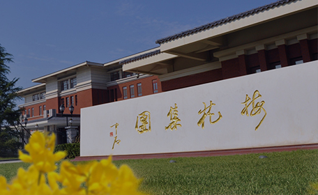
Meihua Launches a New Logo
2024-10-12
October 15th is destined to be another memorable day in the history of Meihua's development. After nearly a year of meticulous design, the brand-new image of Meihua brand finally makes a splendid debut.
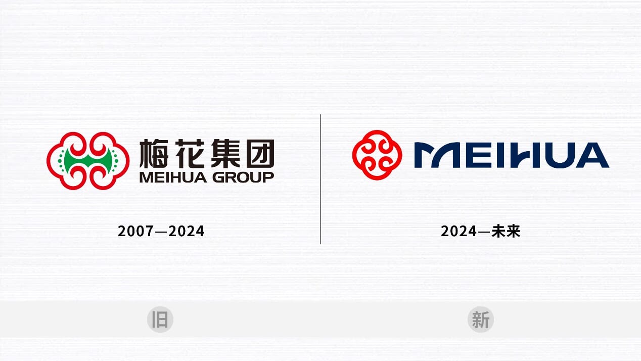
Aesthetic Evaluation of the New Logo

Shape: The new logo continues to uphold the spiritual connotation of harmony and auspiciousness of the original one. It is outlined in a circular shape, delineating the beautiful vision of progression, suggesting a dynamic process of creation and development. The word mark directly uses the English name of the enterprise, reflecting a more modernized and international image.
Color: The Meihua Red in the new logo symbolizes infinity and auspiciousness, representing energy, warmth, and collaboration. The combination of Meihua Blue with red creates a distinctive visual identity, embodying responsibility, determination, and stability.
 Red:Energy, Warmth, Corporate
 Blue: Responsibility, Valiant, Statutory
New Logo and Brand Display
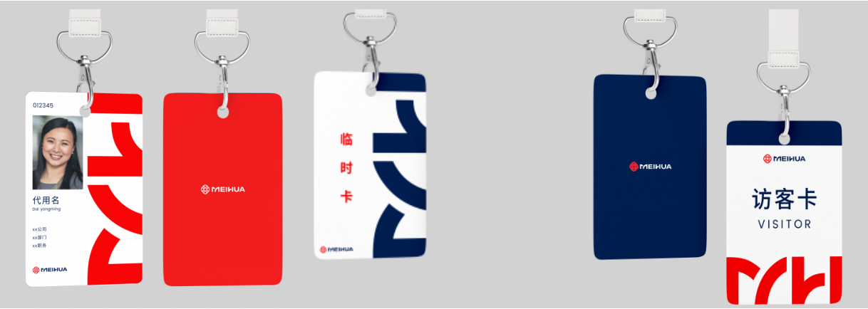
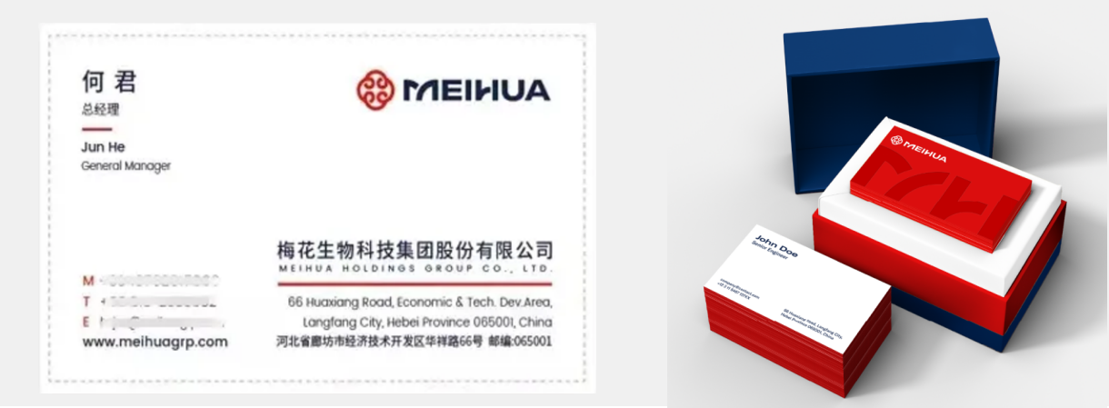
Along with the brand-new logo, the company has also carefully designed a series of merchandise that combines aesthetic appeal and sophistication, exuding an international flair and modern sense.
Office Supplies - ID Cards - Business Card Holder
Office Supplies - Desk Nameplates
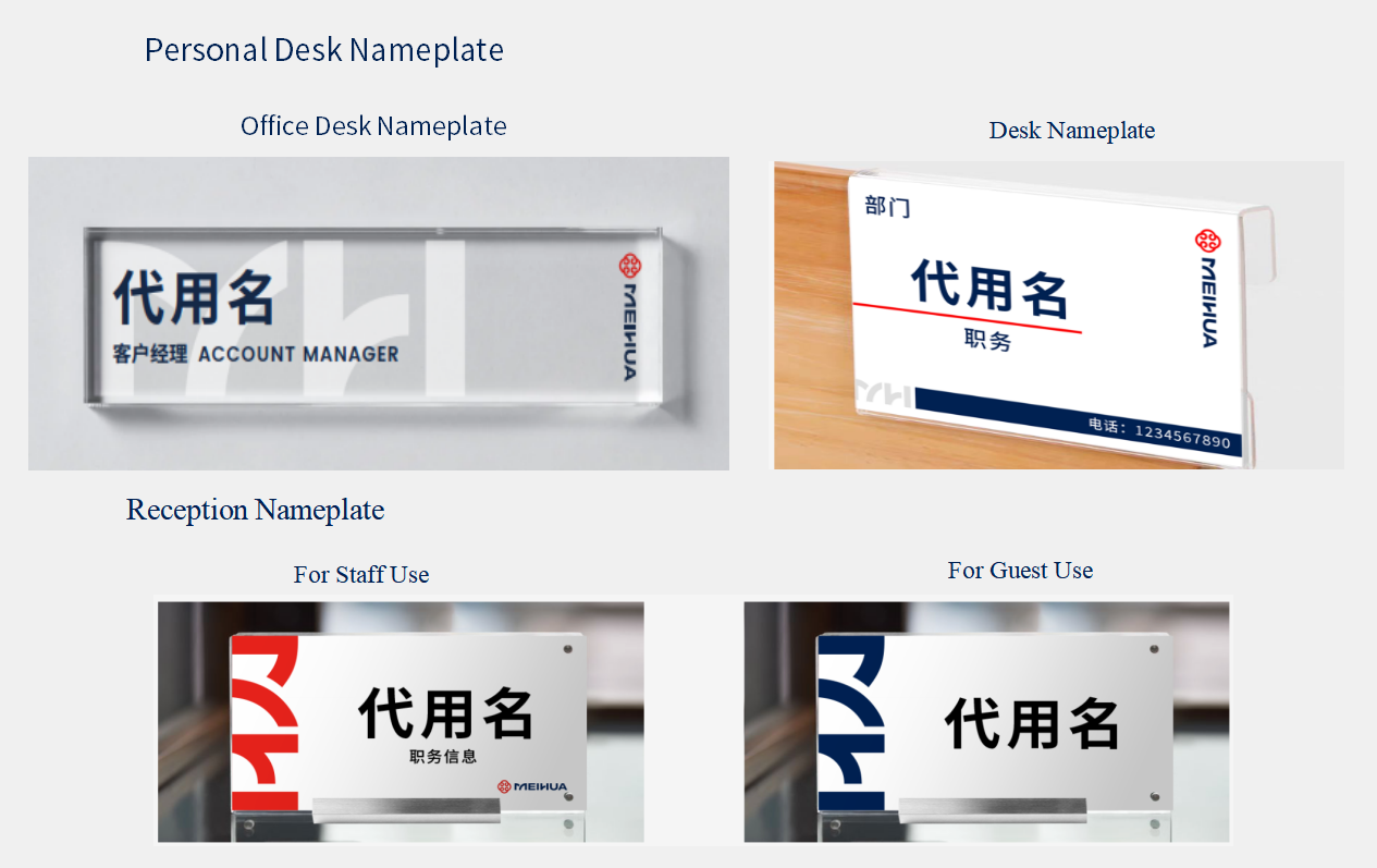
Visual Promotional Banners


Cultural Merchandise- Gift box


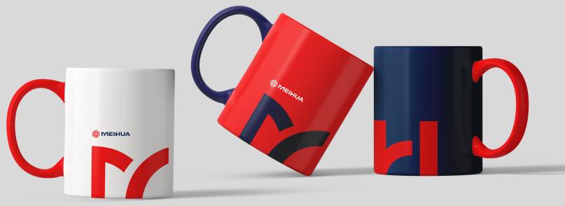
Cultural Merchandise- Canvas Bags
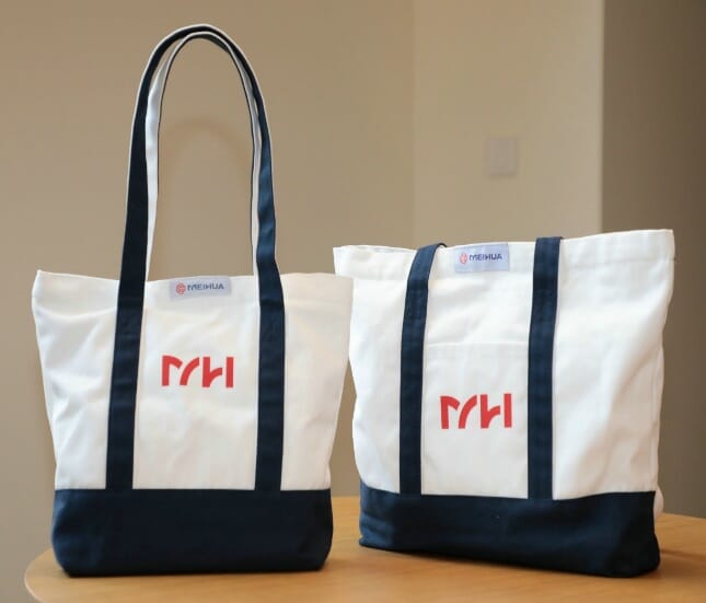
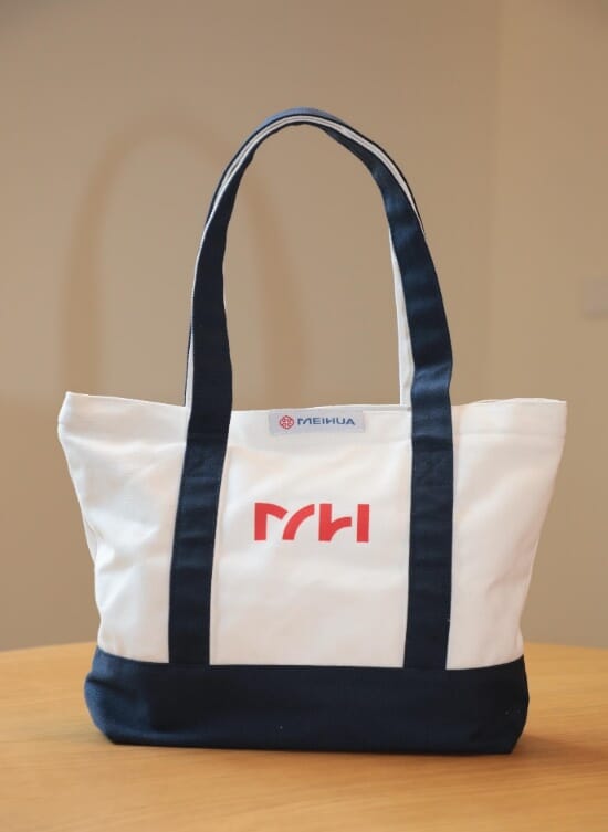
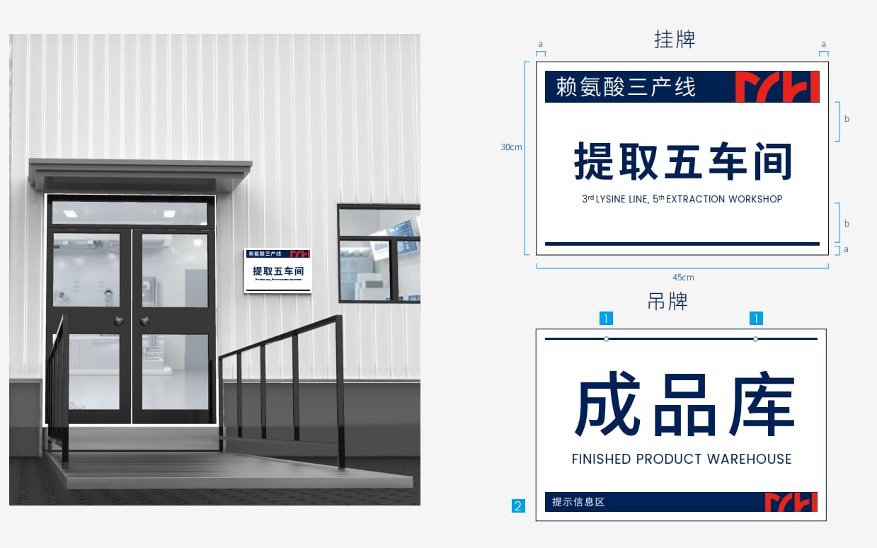
Directional Signage - Entrance Signage
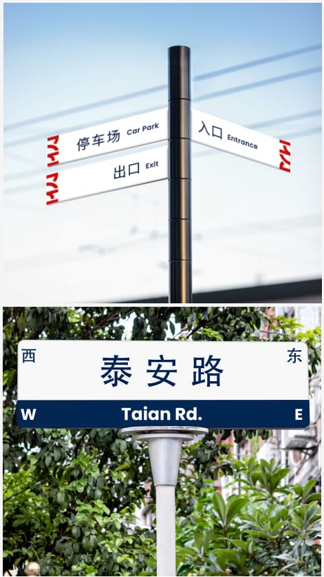
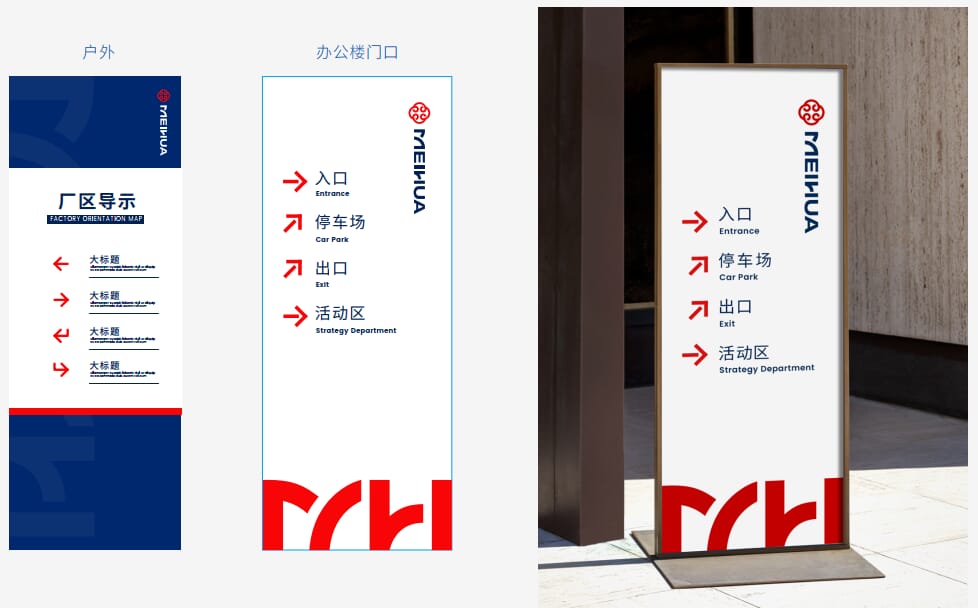
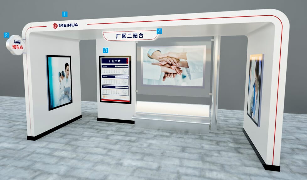
Directional Signage - Outdoor Directional Signs, Bus Stations
The new image reflects a new outlook
The new image leads to new development
Together, for a Brighter Future
Latest Articles
-
Practice Responsibility and Commitment, Jointly Build a Sustainable Future - Social Responsibility Policy
Meihua Biotechnology Group Co., Ltd. (hereinafter referred to as "Meihua Group") has introduced the SA8000 Social Accountability Management System.
15Dec2025 -
Tongliao Meihua MSG Products Successfully Passed the Carbon Footprint and Water Footprint Certification17Dec2024
-
Meihua's ESG Practices Earn Dual Recognition, Marking New Milestones in Sustainable Development30Oct2024
-
Meihua Launches a New Logo
New Brand Image Meihua Brand Image Undergoes a Major Transformation
12Oct2024 -
Nurturing Young Talent – Meihua Group's 2024 Campus Recruitment Training for New Graduates Successfully Concludes
Around August 16th, Meihua Group held graduation ceremonies for its 2024 campus recruitment training at the headquarters and various regional bases.
20Aug2024 -
Meihua Holdings Group Co., Ltd. 2024 Semi-Annual Report30Jul2024


